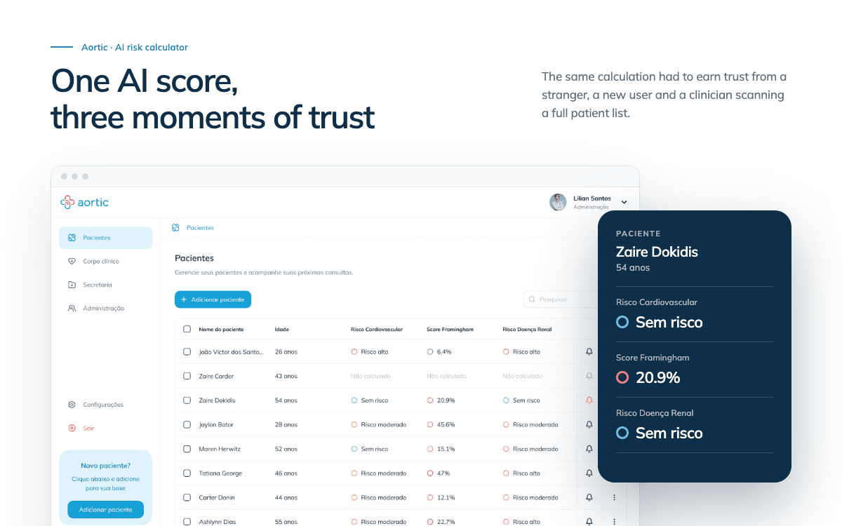
The one where an AI risk calculator earned 25% physician adoption.
I designed, and partnered with a developer to build, Aortic — a medical management SaaS with an AI-driven cardiovascular risk calculator at its core.
If you're in a rush, here's a summary 👇
Aortic is a medical management SaaS, with an AI-driven cardiovascular risk calculator at its core. The design problem: make that one AI result legible and worth paying for at three moments: a stranger's blurred preview, a first real calculation, and daily use across a patient list. North star: in early testing, how many physicians with early access turned into daily, signed-in users.
My Role
Product designer, for three months. I owned the project end to end, from research through delivery, and partnered with a developer to build the final release.
Problem
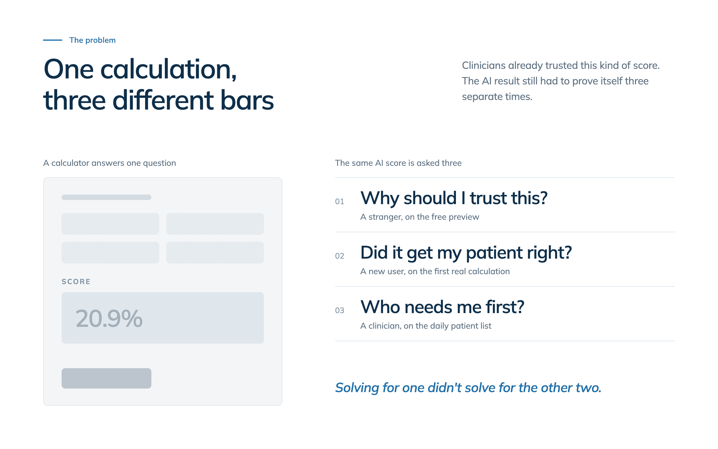
At Aortic's center is an AI-driven cardiovascular risk calculator: the same score whether you're an anonymous visitor or a signed-in clinician managing patients daily. This case is about designing that one AI result for three very different moments of trust. Clinicians already trusted this kind of score. Framingham-style calculation is routine, and running it by hand was genuinely monotonous, which is exactly why it became Aortic's front door. Other systems already offered that same single-formula calculation; AI is what let Aortic combine it with cardiovascular and renal disease risk into one read, instead of three separate lookups. But that AI result still had to clear three different bars: prove itself to a stranger for free, earn a first real read from someone who'd just signed up, and stay fast to scan for a clinician working through dozens of patients a day. Solving for one didn't solve for the other two.
The design challenge
How might we earn trust in the same AI-driven risk score at three different moments, so the result feels legible and worth paying for every time, not just once?
Research
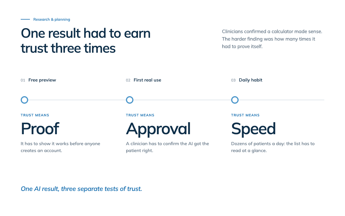
The harder finding, once clinicians confirmed a calculator made sense: that one AI result had to earn trust three separate times, as a free preview, a first real use, and a daily habit.
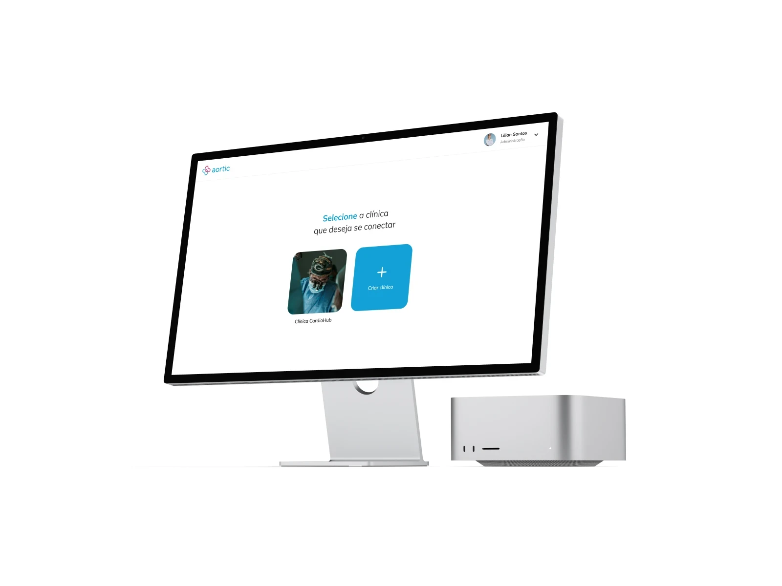
Design & Prototyping
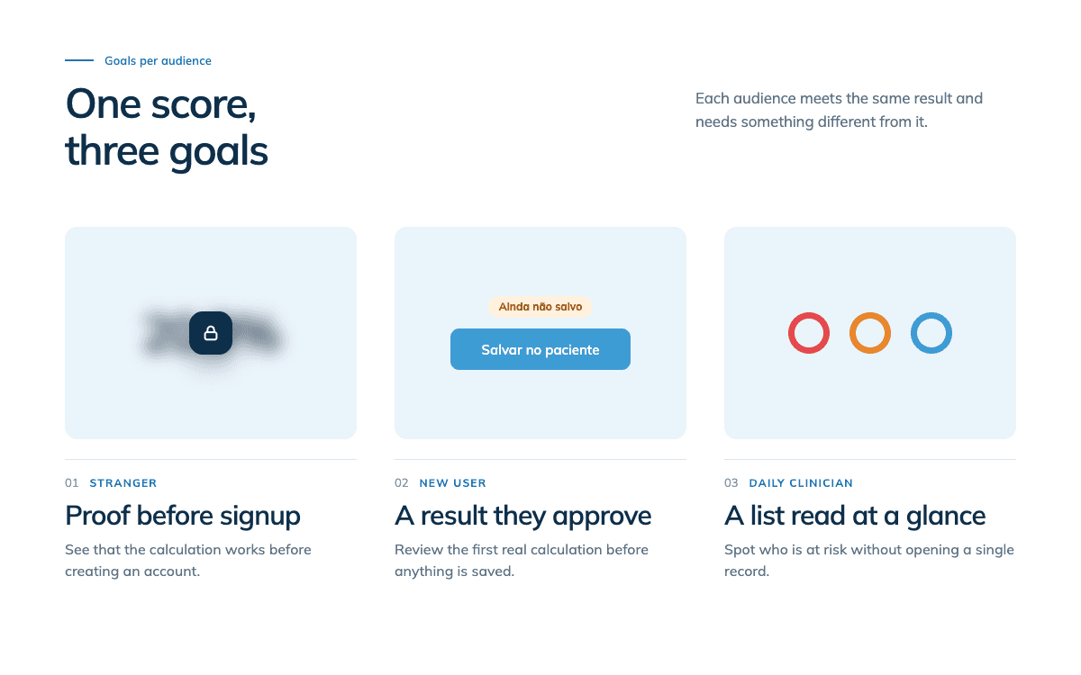
Stranger, free preview: “Acessar calculadora” runs the same AI calculation with no account and no patient record, just the inputs the score needs. The result comes back blurred: enough to prove it worked, not enough to read. Creating an account is what unlocks the clear number: proof first, signup second. First real use: Inside the app, that same calculation sat behind a full patient record: name, insurance number, address, before you even reached blood pressure or risk factors. Separating “run a calculation” from “create a patient” meant calculating is opt-in, and the result lands on its own review screen before anything is saved. That extra step isn't friction to design away. It's the moment a clinician actually confirms the AI got it right, so the output is something they approve, not something the interface commits on their behalf. The underlying assumption being tested: Would treating trust as three separate problems, not one, make each version of this AI result feel legible and worth paying for on its own terms?
Validation
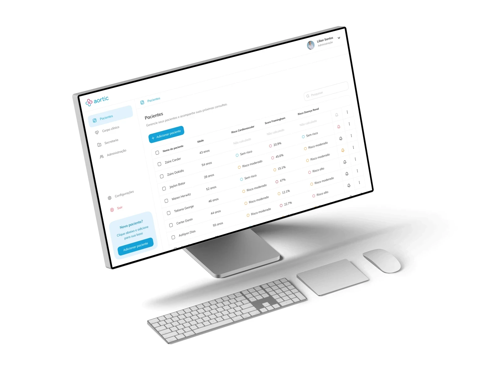
I ran the design through prototyping sessions and feedback loops with healthcare professionals across 2 rounds of testing. What I learned: In usability sessions, 4 of 6 clinicians hesitated before trusting the automated risk score, often re-checking the patient's raw data manually before acting on it. Problem hypothesis: The score was shown as a bare percentage with no visible reasoning, so clinicians didn't trust a number they couldn't audit. Action: Added a breakdown showing the top 3 contributing factors behind each score, and color-coded the risk level instead of showing percentage alone.
Outcome
Primary result: Time to review a patient's risk status dropped from 3 min to 1.8 min in follow-up testing (−40%). Secondary result: 5 of 6 clinicians said they'd trust the score without cross-checking, up from 2 of 6 before the change. The redesign was approved by the CEO for development handoff, with the risk-breakdown pattern adopted as the default across all patient views.